
Search Content
186 results found with an empty search
- Using SVGs in Power Apps
Ever wanted to add fun animations and visualizations to increase the appeal of your app? Power Apps supports SVGs to make your apps prettier and easier to use. Whether it’s progress bars you’re after or objects that change with user-inputted text, SVGs are a simple, powerful way to make a business application pop. In this post, we’ll take a look at how to get started with SVGs using Power Apps and explore some of the things you can do. Remember if you subscribe to our curated library, you’ll have access to download the SVG app created in our YouTube Video . What is an SVG? SVG stands for Scalable Vector Graphic . It’s a piece of XML code that defines a vector-based graphic meant to display on the web. In Power Apps, SVG objects are defined with the tag. Every attribute that the SVG has is then written out as code. Unlike other image formats, SVGs have a few unique features that make them better suited to environments like apps or the web. They: Can be created and edited with any text editor. They don’t require a fancy editing program, either. Are scalable. They’re also zoomable and won’t lose quality if they’re expanded, resized, or printed at different resolutions. Use an open standard. Anyone can access and implement them. That means a lot of resources and libraries exist out there. What Can SVGs Do in Apps? SVGs make your apps prettier and easier to use. Since it’s possible to animate every single element and attribute, there’s a lot of flexibility built right into this image format. Some common ways SVGs get utilized in business apps include: Progress Bars Indicators Animations Drop Shadows Blur Effects Dynamic Text Inputs How to Use SVGs to Make Your Apps Prettier and Easier to Use It’s easy to get started using SVGs in Power Apps. Inserting SVG codes into Power Apps is similar to inserting them into a website. To use them, follow these four steps. Insert an Image Control in Power Apps To insert an image control, select “Media” and “Image” on the Insert tab. This will create a block inside which the SVG will appear. Insert SVG Code Two ways exist to insert SVG code into Power Apps: 1. Insert code directly into the image control in Power Apps. Replace “SampleImage” with the code for the SVG. It might look like this: "data:image/svg+xml," & EncodeUrl(" ") It’s easiest to drop a new SVG code between the tags, although the first lines will remain the same: "data:image/svg+xml," & EncodeUrl(" . Remember to switch all double quotes to single quotes when pasting code from another source. Likewise, the dimensions of viewBox might require some adjustment. Plenty of SVG code libraries also exist online. Consider these options to get started: W3Schools SVG Tutorial PowerApps911 Training Resources and Demo Apps 2. Insert an SVG file. Instead of inserting the code into the app yourself, you also have the option to download an SVG file and upload it into your app. After inserting the image control, choose the “Image” dropdown under the properties pane on the right hand side of the screen. Then choose “+ Add an image file.” Select an SVG file to insert a scalable vector onto the page. Modify the Properties After grabbing the code, modify the properties as necessary. SVG code can consist of either XML code or CSS-like code. If option one was used above, this can be done directly in Power Apps. If option two was used, the SVG file itself will need to be edited. Add Functionality Power Apps allows the insertion of commands to change values in an SVG code. For example, to allow users to change the stroke width (border thickness) of the SVG circle above, insert a slider by visiting the Insert tab and selecting “Slider” under “Input.” Then change the SVG code in the image control to reference the output of the slider. It should look similar to this: Remember that the ‘&’ allows you to connect one thing to another. In this case, a string of code with the output from the slider element. Get More Tips and Tricks from PowerApps911 SVGs are a great way to make your apps more visually appealing for users. They’re a good option to consider if you’re looking for impactful visuals. We’ve covered how to get started with them and provided a few useful resources to make the process simpler. Want to take it to the next level and learn to build any business applications you might need? Enroll in our master classes online .
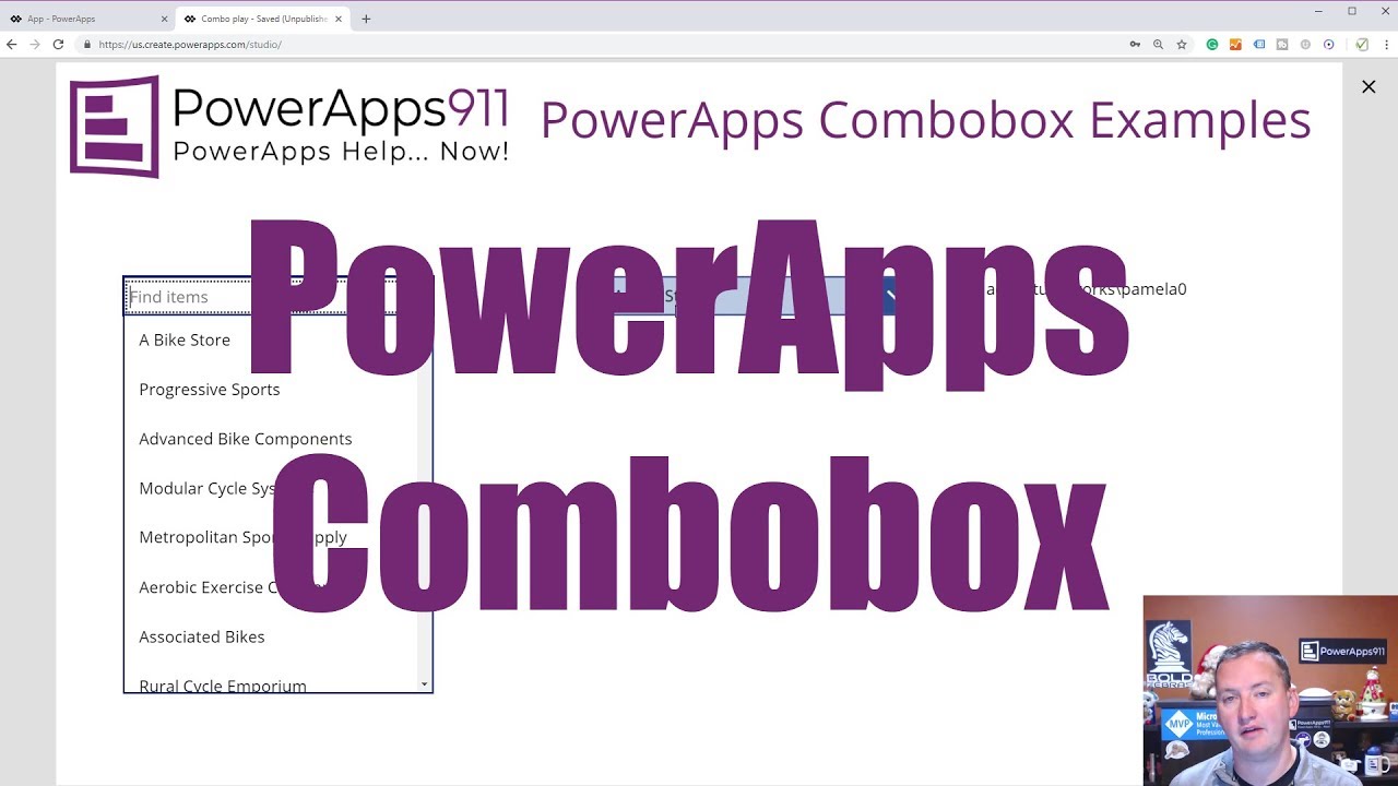
- Search, Filter, and Set Default Values for a Combo Box in Power Apps
While building applications for your business, you may come across instances where you must allow users to make multiple selections from provided choices. Looking up employee records or the contact information of reps for specific brands are two such instances. Fortunately, Power Apps has a way to handle that. A combo box is a control that allows users to search for specific items and select many of those items. Since the search is performed server-side using the SearchField property, it can easily handle large data sources. Here’s a closer look at how to use a Power Apps combo box to search, filter, and set default values. Follow along with our YouTube video. How to Search, Filter, and Set Default Values for a Combo Box in Power Apps Top on the list of most useful features in Power Apps is the combo box. A combo box looks like a drop-down tool, but its functionality makes it so much more than that. Here’s how to use Power Apps combo box to search, filter, and set default values. Creating a Combo Box To create a combo box, select “Insert” then “Controls.” Choose “combo box” from the drop-down. It will default to the ComboBoxSample, but a Data pane will open to the right. Simply replace the data source in the drop-down given there. (Here’s how to add data sources to Power Apps.) Next, select the layout. Three choices exist: Single. One field of data is shown in the combo box. Double. Two fields of data are shown (our very first example used this). Person. It’s the double layout with an image. Finally, select the primary text and the secondary text (for double layouts), as well as the SearchField. How to Search SearchField governs in which field the combo box will search when the user types into the box. The default is the primary text, but you can change that. The easiest way is to simply change the value in SearchField. But if you want to search multiple fields, choose “SearchFields” from the properties drop-down next to the functions. Then, simply include the fields desired. For example, we changed: SearchFields = ["Company Name"] to SearchFields = ["Company Name", "SalesPerson"] Our combo box then searched both the company name and the salesperson name when we typed in a value. How to Filter Data Filtering is helpful when you’re dealing with a large set of data and you don’t want to overwhelm your users. In our example, we filtered our data so that combo box showed only the values where SalesPerson = Pamela. Our code on the Items property looked like this: Filter('[SalesLT].[Customer]', SalesPerson = "adventure-works\pamela0") How to Set a Default Value With a combo box, “default” isn’t a useful property. To set the default value, use “DefaultSelectedItems” instead. This causes specified records to display by default. To set DefaultSelectedItems, use the Filter function for the same datasource you used for your Items property. Other Combo Box Functions There are a few neat functions with combo box that we covered. These are worth keeping in mind because they will come in handy: SelectMultiple: If you don’t want users to be able to make multiple selections in the combo box, then set SelectMultiple to “false.” SelectedItems: The property to recall the output of a combo box is SelectedItems which returns a table of information from your combo box selection. For example, in this tutorial we populated a drop down using “ComboBox5.SelectedItems.EmailAddress”. Concat: To turn a field in the table output from SelectedItems into a string of text, we used: Concat(ComboBox5.SelectedItems, EmailAddress, ", ") DisplayFields: Change these to alter what data comes back when a user makes a selection. Master Power Apps Combo Box and More with Us Combo box may look like a drop-down, but it has more functionalities and requires some slightly different functions. We’ve covered how to search, filter, and set values in a Power Apps combo box plus given you a heads up about especially useful functions. Just remember: combo box likes to pass records. As long as you nail that, you’ll have no trouble using combo box to pull the data your business needs. Want more tips? Enroll in our master classes online.
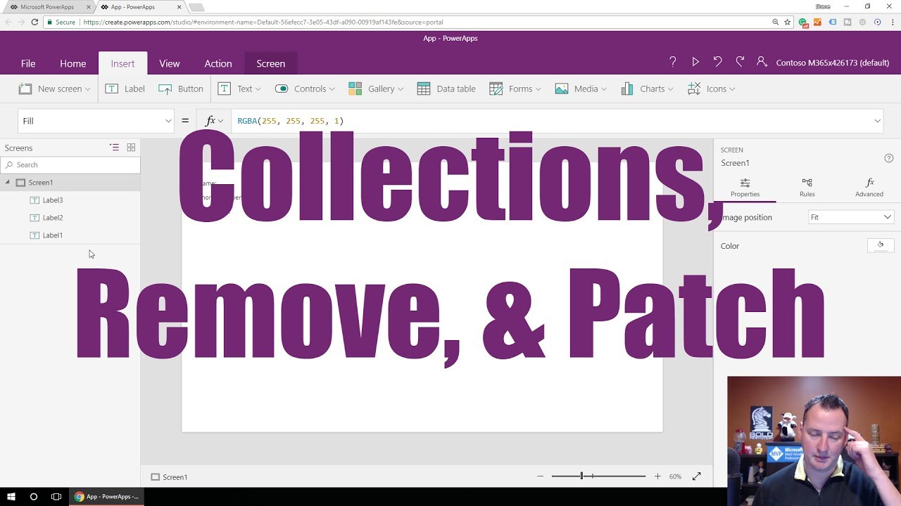
- Working With a PowerApps Collection
In this tutorial, we will be answering a question by one of our PowerApps users on how to work with a collection in PowerApps. The tutorial will cover collections, which are a special type of PowerApps variable. These allow you to work with the data as a whole data instead of just individual pieces of information. And this is pretty handy. What are Collections? Most variables set one piece of information and retrieve that one piece of information - whether in context or globally. Collections, however, let you create a table of information so you can store bigger things, such as shopping cart data, or a whole bunch of data to let users prune though it before you submit it and send it off on email. Collections open up the ability for you to create a bunch of different solutions. In this Tutorial We start with the basics on how to use PowerApps Collections and how they work. After this, you will then be able to move on to the more complex stuff in subsequent tutorials. The functions we will use in this tutorial include Collect, ClearCollect, Patch, and Remove. If it's other types of variables you are after, don't worry, we have a video covering global and contextual variables. To watch Intro to PowerApps Variables video, click here . Getting Started with PowerApps Collections Collect First up, sign in to PowerApps . Once you're in, click on Create, and then Canvas app from blank . We're going to work with a blank template, so click Tablet under Format and name your app. Tablet format will give you a little more space. If this is your first time creating an app, you may see a pop-up, just click Skip to skip over the tutorial. Pro Tip: It is a good idea to watch the tutorial at some point. So let's get to building out and working with a collection. Firstly, click the Insert tab and click the Label button . Make three labels: Name, Phone Number, and Comments. Pro Tip: Once this is done, it's good practice to go into the Tree View on the left panel of the Screen and change the name of your labels. Try following a naming convention like starting the name of all your labels with “lbl”. Now click the Insert tab and click the Text button and choose the Text Input option . Do this three times and align them alongside your labels. Once this is done, delete the default text in these Text Input controls by selecting the Default property in the property dropdown at the top or the properties pane on the right side of the screen . Now go and rename these in the tree view : I_Name, I_Phone, and I_Notes. Then click the Insert tab and insert a Button . Double click on the button to change the text property; type Add to Collection . Side Note: To use a collection, you simply have to define it with the Collect or ClearCollect functions. You don't have to define it elsewhere or set it up ahead of time. All you have to do is pass some data, give it a name, and make a collection. To set up your collection, go to the OnSelect property of your button and type in the formula bar: Collect(ContactInfo, {Name:I_Name.Text, Phone:I_Phone.Text, Comments:I_Notes.Text}) You can check if this worked by clicking the Play icon at the top right of your screen, which enables your Preview mode, and then you can type in the text for each column and click the Add to Collection button . Although it doesn't look like anything has happened, we simply don’t have a way to display the collection yet. To check the contents of your collection, close Preview and click the View tab and click the Collections button , it will show you the first 5 rows of information for your collections. Now let's go back so we can add more to our collection. Click the Back button and then Play icon and type in your dog's name, partner's name, mother's name, etc. and comments and click Add to Collection . Close Preview, and now we have some more data added to our collection. Gallery If you want to have a feature that allows you to look at your data in the app, you can use a gallery. So click the Insert tab and the Gallery button and for the tutorial let's choose the Vertical option . It will be added to your page. Now, realign it to where you want it on the page by dragging it. Once it's placed, click DataSource in the Gallery pop-up box and you'll see your ContactInfo collection listed there. If you click it , the gallery will display your collection instead of sample data. You can choose Layout on the right hand properties pane . For this we don't have any images, so we'll just choose Title and Subtitle . Set Title to the person's Name and Subtitle to the Phone number. Now if you click the Play icon, you will see the records show up and add more Now that you know the basics of how collections work, you can use them for different scenarios. Clear the Collection Let's look at how we can manipulate the data in your collection by clearing it out to start from scratch. First, close the Preview screen . Highlight the Add to Collections button, and hit Ctrl + C and then Ctrl + V to copy the button. Move the new button next to your first button on the page. Now change the button text by double clicking or going to the Text property to say Clear the Collection . Now in the properties dropdown, choose OnSelect and type Clear(ContactInfo) in the formula bar and that will do it. Click the Play icon , and then hit the Clear the Collection button . You'll see that all the data is now gone. Remember to leave data in your list before you click to Clear the Collection. It's easier to work that way so that you can learn and test easier. Pro Tip: You can press and hold down the Alt key while testing features in your app to enable preview mode without pressing the Play icon or expanding the application. There is also a command that you can use called ClearCollect. ClearCollect will clear out the collection and then start putting data back in. The idea behind this to be able to wipe out and replace data in one step. Remove Now you know how to create and clear out your whole collection, but what if you want to get rid of just one record or row in your collection? Click on the Gallery card and click Insert Tab and the Icon button, and then choose the Trash can icon . Now grab the icon and move it to where you'd like to see it, adjusting the size if necessary. Now type into the OnSelect property in the formula bar Remove(ContactInfo, ThisItem) . ThisItem represents the item which is currently highlighted. Once you've added this prompt, you can click on your Trash can , and you'll see the item disappear. Easy as that. PowerApps is giving you the ability to work with individual items through the gallery. And now if you click Add to Collection , you'll see more items appear with the trash can icon as you click and have the ability to delete them as you wish. Working with Items Next, we'll focus on how to work with items. If you take a look at the comments, it doesn't have a lot of space to show you all the comment text. You can add a separate screen at the bottom that will allow this. So click the Insert tab and the Label button . Grab the label and move it where you want, and double click the label to change the text. Type in Item Details . Then click on the Home tab, change the font to make it stand out a bit to show it's important. Once this is done, click on your Name label on the top of your screen and copy it by clicking Ctrl + C and pasting it below your new Item Details label by clicking Ctrl + V . Then click the Insert tab and the Text button and choose the Text input option . Drag and place it under the new Name label. Now go to the prompt bar and delete the Text Input text , because what we want is to specify the current item that has been clicked on. To do this, specify the name of your gallery, the item, and the field you wish to show. Type in Gallery1.Selected.Name Now let's look at that in Preview mode. First, quickly add to your collection. When you have done that you'll see the arrow in the Gallery card. If you click the arrow, you'll see the name details change at the bottom in the Item Details. Side Note: Another thing we could have done with the arrow icon is to Click on the arrow icon then type in the OnSelect property in the formula bar Select(Parent);Navigate( Screen2Name ) - replacing the underlined portion with the name of an additional screen if you had one. Let's finish up the Item Details task. Click on the Phone Number and Comments labels at the top of your page and then copy and paste them by clicking Ctrl + C and Ctrl + V . Then drag them to the bottom of the screen under the new Name label. Once this is done, add the Text Input again by clicking the Insert tab and the Text button and choosing the Text Input option . Make the default property in the formula bar Gallery1.Selected.Phone for this input. And for the next one, Gallery1.Selected.Comments Make the box for the Comment Text Input bigger than the rest of the boxes, so you can read all the comments. Edit Now if you go back to the Preview screen, we can see things look a bit awkward. Although you can type in the comments section in Item Details, there is no way to save this information. If you don't want users to be able to edit the fields,you need to Select all three fields and go to the Home tab and click the Group button , and then we can set a property. In the Screens tab on the left, you can see Group1 added. Click on the dropdown arrow in the Properties bar above the tree view and click Display Mode . You'll see in the formula bar that the default for Display Mode is DisplayMode.Edit - delete Edit and type in DisplayMode.View to see what happens. In Preview mode you'll see that you now can't type/edit in the Item Details fields anymore. But what if the users want to edit these fields? Okay, let's do that. We'll start by adding another icon. Click the Insert tab and the Icon button, choose the Edit/pencil icon and drag it down to the bottom with Item Details. While you have the icon highlighted, you can set the variable. For the OnSelect property type into the formula bar Set(Edit, rue) - then click on your grouped labels and click on Group1 in the Screen tab , and above this you'll see the DisplayMode property. You'll need an If statement in the formula bar. So type If(Edit, DisplayMode.Edit, DisplayMode.View) So let's check if that worked in Preview. Click on the Edit icon, and you can see that you can edit the labels. To make it look better, you may want to have the Edit icon be a toggle or a button that says turn off Edit Mode, etc. Save and Patch The last thing we'll cover is how to overwrite existing data if your user took advantage of the Edit button and they changed a field such as the Name. After they are done making a change, you'll want the edits saved. Click the Insert tab and the Button button and drag it under the Edit icon in Item Details and change the text on it to read Save . In OnSelect property in the formula bar, we're going to apply a patch. A patch applies the updates to a specified row and changes it in the data source. T ype in Patch(ContactInfo, Gallery1.Selected, {Name: I_Name2.Text, Phone: I_Phone2.Text, Comments: I_Comments2.Text}) Side Note: If you didn't label your Group1 fields in the Screens tab, this is where it can get confusing, so label them now - I_Name2, I_Phone2, I_Comments2. Now let's see if that worked in Preview. Edit the first name, click Save and then you'll see in your Gallery item at the top, the name has been changed. Using Patch, you can edit the data for a collection, but it also works on your other data sources which we will further explore in future tutorials. And that's a wrap. You now know how to create a collection, delete all the rows to clear the collection, remove an individual item out of a collection, and how to edit specific items in the collection. Why PowerApps? If you're looking for an app that lets you build seamless and professional applications for your business, PowerApps is your best bet. PowerApps can help you easily streamline processes and solve challenges your organization may be facing. Plus, PowerApps lets you customize and optimize every detail of your app for specific tasks and roles. Whatever your requirements, PowerApps lets you build all the business applications you need. Whether you need assistance with an issue or complete project services, PowerApps is here to help. To watch the full video tutorial on Working with a PowerApps Collection , click here .
- Create Your First Custom App for Microsoft Teams with Power Apps in 5 Minutes
Power Apps is extremely powerful for anyone looking to be able to rapidly create environment apps for your business. With Power Apps, it's possible to create simple solutions and deploy them to your team to be able to add automation, easy-to-use front ends, and drive action. With this guide, we're going to help you create your very first Power App and show you what the software can be used for. Follow along with Shane's guide on Creating Your First Custom App on YouTube: Step 1: Create a new Microsoft Teams Team To build your first Power Apps app, you're going to need to create a new Team. All Power Apps instances need to be tied to a team. Once we build this first app, we'll put you on a path to making your own additional custom apps. This guide is just get you ingrained in this new ecosystem of Microsoft Power Suite and Project Oakdale. Create a new Team in Microsoft Teams. Once it's set up (it may take a few moments to load up), we're going to add Power Apps to that Team. Step 2: Add the Power Apps (Preview) App to that Team Go over to the ellipses on the left, and Add a New App. We're not selecting Power Apps - instead, we're going to select Power Apps (Preview). Click it, and it will add. It'll automatically pin to your apps on the left, and it'll open up the Power Apps functionality. You can pin it so you don't have to hunt it all down later. Step 3: Create a Test App Now that that is built and installed, go ahead and click "create an app". Select the team you want, because every team that you create an app in is in a self-contained world. Each team has its own data sources, its own apps, and so on. You don't have to create a channel - just select your team. This process will take a minute, as it's provisioning all of the infrastructure required. Not only does this give you the ability to create apps, it also creates a really rich data source called Common Data Service. And so the common data sources, a light version of that, but it's underneath the hood that's going to let you store your data there, which might be a little bit different if you built an app before we stored data and SharePoint or Excel or SQL. The Common Data source is the fastest data source going, and it's got a lot of other robust features that allow. This is great for us non-developers - I have never written like a C sharp code my life. Probably you haven't either. As a non developer types, we're still going to be able to take advantage of that data source. Take a minute, go grab a coffee, and let it set up the environment. Once it's set up, you'll be able to access the dashboard of that app - the Hero Template. Step 4: Starting at the Hero Template, Create and Fill a Table Once you're in, you'll be at the "hero template" as we say. The hero template is going to get you started. Now, I know I can build an app so fast with you guys, so the first thing you want to do is over on the left, click on create a new table. Give your table any name you want. You might want to make it something descriptive. And so typically with me, I use examples like my employees just because it's a fun little data set. But maybe you need to track stuff in it's inventory, maybe it's projects. You know, just think of this is the same way. If you will go make a new spreadsheet over an Excel to track some data, that's the same thing you're doing here. But instead of being in an Excel file, it's in a rich, powerful database under the hood. In the video, and in this example, I'm just going to call it my employees to make my life easy. Another little pro tip here, always check in advanced settings. For this, it's only the plural table name. Who cares, right? But always look at the advanced settings and look to see what's there. So you know what you have the ability to do in the future. So now they create and this is going to provision us a table and it gives us this fun little table. This is where we'll start wanting to populate data. In my example, I want to have the very first thing I want to talk about my people is not their name. It's actually going to be their title. So I select from the column header's dropdown what kind of data I want there. Tons of options. Once you select the type of data that's going to be there, and I've titled the column, you can start adding additional columns for new types of data. Step 5: Modifying Your Hero Template to Fit Your Needs Once you've populated your database with the correct fields, you can return to your hero template and see what it's done to display your data. From here, you can adjust the template columns, colors, or a myriad of other options - to suit your needs. It's that easy! Once you've started with your basic template and functions, you can add new information to your database and start customizing your app to suite your needs. Learning More About Power Apps We've created tons of educational tutorials, just like this one, on the Power Apps 911 YouTube Channel! There, you can find tons of helpful tips, news updates, and more to help become a master of Power Apps. Want an even better educational experience? We've created full classes to help anyone become a Power Apps expert. Head on over to our Power Apps Training Center to get started.
- How To Create an App Using PowerApps with a SharePoint List
PowerApps lets you build seamless and professional applications for your business. With PowerApps, you can easily create an app that modernizes processes and helps solve some of your organization's challenges. Plus, PowerApps lets you customize and optimize every detail of your app for specific tasks and roles. In this post, we’ll take a look at how to create a simple app using PowerApps with a SharePoint list. Here, we include a step-by-step guide to help you create your first PowerApps application. Follow along with our YouTube Video. Learning How to Create a PowerApps App with SharePoint Data In this post , you will learn how to create your first PowerApps App using SharePoint data. Next, you’ll learn how to make a few quick edits and customizations to your app. This tutorial aims to help you get the hang of PowerApps’ capabilities before trying your hand at building more complex applications. After this tutorial, you will be able to: Connect to SharePoint data Make edits Share your app via email Publish it and view it on your phone Let’s get started! Your Step-by-Step Guide To Creating a PowerApps App Start with a Simple SharePoint List For this example, we have created three columns: Title, Color & Animal. This has been built using PowerShell. ( If you don’t know how to do this, you can watch the video tutorial here. ) Remember, we have made this example simple so that it’s easy to follow. Open PowerApps Next, go to https://powerapps.microsoft.com and sign in. If you don’t have an account already, you can sign up for free. Wherever you are in the world, it will redirect you to the language appropriate version. Create Your App Once you’ve signed in, click on ‘Apps’ on the top left-hand corner. If you have created any apps previously, you’ll see them here. Next, click on the ‘Create App’ button to create a new app. Choose a Type of App Now, you’ll need to select the ‘SharePoint App’ option with a ‘Phone Layout.’ You’ll see the other app options available and other data sources you can start with. You can even begin with a completely Blank App. Connect To Your SharePoint List It’s time to connect your app to the SharePoint list you previously created. You’ll need to go back to your SharePoint site and copy and paste your URL. (Note: don’t include the list, just the URL). Once you’ve pasted the URL, hit ‘Go.’ Select Video Lists Next, you’ll see the available lists. You’ll notice that these are just lists and not document or picture libraries. Because we are just getting started and want to keep things simple, let's start with selecting 'Video Lists.' Quick Connect Once you’ve selected ‘Video Lists,’ hit ‘Quick Connect.’ Once you hit this button, it pulls all your data from the SharePoint list that you created. And, just like, that you have an app with a few screens you can work from. Preview Your App If you hit the ‘Play’ button, you will see a preview of your app. You’ll notice that you have both the Color and Animal columns displayed. For some reason, the Title column is missing, which we can figure out later. Explore and Edit Items If you click on one of your items, you can see the different details of each. If you click on 'Edit', you can see what you can and cannot edit. Here, you can clean up a few details and make various edits. When you create a new item, it will essentially take you to this same ‘Edit’ window. Master PowerApps. Enroll in our PowerApps Courses Online! Customize Your App Let’s return to your home screen by clicking ‘X’. Next, hit the ‘Browse Gallery’ on the left-hand side. You can see a control panel, where you can view different fields, and you can control the layout, title, and subtitle. Change a Title Right now, for the title, we’re using ‘Animal.’ So, let's change this. Click the ‘Drop-down,’ and you’ll see each of the different fields. You’ll see Body 1, Subtitle, and Title, which you can change. Now you can see how you can customize it with just a few simple clicks to choose the data you wish to show. Working with ‘ThisItem.’ Let’s have a bit more fun and take the customization a bit further. In the color column, the value here is ‘Blue.’ Let’s see how you can modify this. So, if you click on ‘Blue’ you’ll see that the text is coming from ‘ThisItem. Color’. (Found in your ‘fx control’ panel at the top) Side Note: ‘ThisItem.’ Is an excellent concept to grasp when working with PowerApps because it shows the value of the current item you are working on in each of the blocks below. Changing Color Fields In this case, you’re going to use the color field, which is one of the columns from your SharePoint list. On the right side, you can see there are lots of controls for doing things such as updating. Here you’ll see you can change things like the text color too. A Side Note: The more you use PowerApps, the more you will see that you can work in different areas. There are different levels of functionality, depending on where you’re at. The Drop-Down Menu You can also alter fields if you select the drop-down menu at the top left-hand side that says ‘Text.’ These are all the different controls, and you'll see that the ones that are bolded are ones that have been changed from their default values. Changing Formulas If you scroll through these, you’ll see that color has actually been modified. In the ‘ThisItem. (found in your ‘fx control’) it says ‘RGB followed by a long list of numbers. You can delete this and use the value that you have stored instead. (You can't just say, ‘ThisItem. and color because that's not an actual color value. You’ll need to use a color value function.) In the grey bar above, it says, “A color specified by name such as blue, or using the standard 6-digit hex notation” Here, you can type: This.item.color. Now you’ll see your blues are blue and your reds are red. Field Sorting You can also change the sorting of a field. Click on ‘Browse Gallery,’ and you’ll see that the items are coming from the long formula above. We won’t break the whole formula down in this post, but you’ll see that it's sorting by columns. The first thing you will notice is the source that's coming from your Video List. The second item behind the comma is what you want to sort by, and the third item is the order. Now, if you hit ‘Play’, you will see the color text and sorting by the title. Side note: One of the easiest ways to navigate PowerApps is to go into this preview and get to the screen you want to fix. Even More Customization Now, click on the detail screen on the left-hand side. Go to ‘Data Sources.’ Once again, PowerApps has given us a great tool where you can adjust the layouts. So, in this case, you can remove the ‘Compliance ID’ and then fix the order. You’ll see it says, ‘Modified, Created, Created By, and Modified By.’ You can simply drag ‘Modified’ down in the field window and move things around as you wish. Name & Save Your App So, now that you’ve made a few changes to your app, you need to save it. Click on ‘Save File.’ Here you will be able to name your app, change the background color, the icon, and add a description. Remember, you are doing all this in the browser, and until you save it the first time, there is no autosave, so you want to save early on and often. Change The Orientation You can also change the screen orientation when you save your app, although this is generally something you’d do before creating an app. You can also do things like lock the aspect ratio here, where you can decide if you want to flip the screen when you turn your phone. Share Your App & View It On Your Phone Once you hit save, you will have the option to ‘Share this App.’ And, you can email it to friends or colleagues with a note or description. Now, go onto your phone and go to www.powerapps.com where you can view your app. If you need to install PowerApps on your phone, click here. There you go, you’ve just created your first PowerApps app! Build Your Own App with PowerApps Today Whatever your requirements, PowerApps let you build all the business applications you need. Whether you need assistance with an issue or complete project services, PowerApps is here to help. To watch the full video tutorial on how to Create an App Using PowerApps with a SharePoint List, click here. Want to become a PowerApps master? Enroll in our master classes online.
- Introduction to Power Pages – Part 1: What is Power Pages?
If you haven’t seen it yet, then you need to check out our new video Intro to Power Pages featuring our own Haylee Adamson. In this blog series, we’ll recap the highlights and hopefully whet your appetite for more. What is Power Pages? Power Pages is a way to build a website based on Microsoft Dataverse data where you can use a low/no code experience to create your website. Using templates, drag and drop interface, and visual controls to adjust settings, there’s no code you need to write to set up your website. Since it’s built using Dataverse, you can put strict controls on what data you’re exposing, and who can interact with it. Why should I use Power Pages? Power Pages is your best bet for allowing users outside of your organization to interact with your data. We’ve encountered some use cases where Power Pages might be your best bet: Mockup of production solution for user training sites Collect demographic information from new customers Collect and provide information to event attendees, such as schedules, dietary preferences, housing selection, and release sign-offs Create a calculator for customers or sales reps to self-serve a quote Create a storefront for clients or reps to place orders Manage service requests Provide a portal for your resellers Manage evaluations and auditions Built on Power Platform Since it’s built on the Power Platform, if you’re familiar with Power Apps and Power Automate, or even SharePoint, you’ll feel at home creating in Power Pages. You may have created web pages around SharePoint data that you could share with other users in your organization, however, it was impossible to share your SharePoint pages outside of your organization. With Power Pages, you can create externally facing web pages (or ones that customers can view)! What about security? Did I mention security? Since it’s based on your Dataverse tables, your users will only see data according to permissions that you place on the data itself. Did I mention how easy it is to begin? Microsoft has provided customizable templates and a cool design studio very similar to what you see in Power Apps. Intro to the Power Pages solution In the next blog post, we’ll begin building with Power Pages together, but for now let’s examine what we could achieve. Haylee has developed a “Community Events” hub where users can add events and view a community calendar. With the ability to “View Events”, a user can see the Community Events on a calendar. Selecting an event shows event details: The hub also allows users (with the right permission) to add community events, by selecting the “Add Event” button from the header. The link brings up a form experience where the user can input the details of the event: Recap To recap, Power Pages is a webpage with a Dataverse data source. That does make it “premium”, in that, there’s a monthly cost for it. The advantage for developers already familiar with Dataverse tables is that you don’t need to create any new data, you can base it on data tables that you’ve already built! You can make Power Pages for audiences external to your organization, which is unique for the Power Platform. You can also use it to harvest data (like Haylee’s “Add event” form), where your webpage users can input data for you. If you’re looking for inspiration, you can take a look at what other organizations have already done with Power Pages here . In the next blog post, we’ll look at how to get your experience started! Resources from PowerApps911 In the meantime, if you’re anxious to get started and you’re new to Power Pages, you can begin with the free Power Pages module (about an hour of content) in our Power Platform 101 course. You can also sign up for our Power Pages Jumpstart course. This 3-day live course, running from July 16-18, is designed to teach you everything you need to know to build your own Power Pages solution.