Building Quick and Visual Reports with Power Apps Reporting not Power BI
- Shane Young

- May 15, 2023
- 3 min read
Updated: Jul 21, 2024
Sometimes, you need a quick visual or report within your Power Apps app without relying on Power BI. While Power BI is often the go-to solution for visuals, reports, and dashboards, there are scenarios where an alternative approach is preferred. In this blog post, we'll explore how to create visually appealing and interactive reports using Power Apps' HTML control, catering to specific business needs. Power Apps reporting is a must in any good maker's toolbox.


Meeting the Customer's Requirements with Power Apps Reporting:
Recently, we had a customer who required a concise pop-up report showcasing invoicing volume across various time horizons. The report needed automatic color-coding through conditional formatting based on period comparisons, and it had to display data for both the company as a whole and specific regions. We collaborated with the customer to develop a solution that fulfilled their needs.
The App and Data:
This app primarily caters to executives on the go, accessible through their mobile phones. However, the app is responsive, enabling users to view it from an iPad or a web browser. For a detailed walkthrough of the app's functionality and formulas, check out our YouTube video Build Power BI Style Reporting with Just Power Apps | Create Beautiful Reports Easily.
To source the data, the customer had three data center regions, each with its own SQL Database housing key data. Initially, we attempted to perform extensive calculations within the app itself. However, to optimize performance, we transitioned to creating a SQL Server view in each region, consolidating the necessary data. This approach offloaded the computational power to SQL, reducing the load on the mobile device.
Leveraging the Power Apps HTML Control:
To achieve a visually appealing table design, we employed the Power Apps HTML control. This control enabled us to apply formatting for table structure, bolding, and implement the color-coded conditional logic that enhanced the report's readability. It's worth noting that while the organization already had a rich set of Power BI reports and dashboards for in-depth analysis, this Power Apps app served as a quick snapshot of the business's status.
Optimizing Performance:
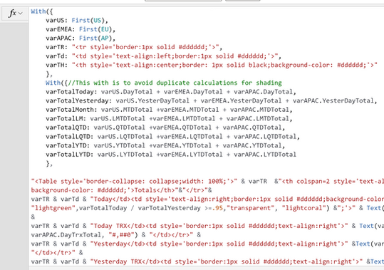
Considering that the app is frequently accessed on the go, performance played a critical role. To enhance efficiency and avoid redundant calls and calculations, we utilized nested "With" functions in our code. The first "With" function loaded the three records, one per data center. The second "With" function executed the calculations required multiple times.
For example, to color-code the "Today" amount, we summed up the total from today's data in the three regions and compared it to yesterday's total from the same regions. By performing the calculation once and reusing the results, we significantly optimized performance.
Conclusion:
Through a combination of HTML customization, thoughtful utilization of "With" functions, and a well-designed pop-up, our customer now has easy access to all their key business metrics at their fingertips. They can perform quick data analysis while on the go, without relying on bulky reports or dashboards. This solution has resulted in delighted executives, equipped with essential data for informed decision-making.
If you need assistance in building similar solutions for your business or have any questions about the Power Platform, please check out our Services or fill out the contact form below. We can assist you with everything from fixing one small problem to taking on full-scale projects. We even offer mentoring and Power Platform Training if learning is your top priority. So don't hesitate to reach out and let us help you make the most of your Power Apps experience!
If you prefer to learn on your own, there is a downloadable app included with this video in our YouTube training library for only $15/month!


Comments